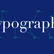


Many of the UI and UX designers out there today are conversant with Typography and can readily differentiate between “baseline” and “mean line,” “typeface,” and “fonts,” etc. However, only a handful fully understands the mechanics behind choosing the best typeface for different designs. And this is why typography should not be overlooked since it can have an impact on the effectiveness of a design. Typefaces are as crucial as the visual aspect of any design. Typography is not limited to selecting the best typeface for your design. It also includes choosing the right color of the text, as well as how the text will fit into the design and layout of the page.
Choosing the Best Typeface: Is it all that Important?
The choice of the typeface used in your design will have a considerable impact on the effectiveness of the message you are trying to communicate on the page. A good typeface significantly increases the reading pleasure of the viewer. It also efficiently engages the audience and influences their perceptual experience of the message the designer is conveying. This is why it is incredibly vital that designers go for typefaces that will invariably link the text with the graphics of the design.
Key Factors to Consider When Choosing the Best Typeface for Your Design
There are several vital factors you need to bring into consideration when choosing the best typeface for your design. This is because certain typefaces are suitable for specific situations and not for every situation. For instance, calligraphic fonts may look fantastic on your design, but it will not be suitable for a site, for say, developers. Here are some other factors that you must consider before choosing the best typeface for your design:
Legibility
A layman will take a look at the words “legibility” and “readability” and immediately assume they mean the same thing. However, typographers and UI designers will readily point out that these words represent two different attributes of text. Legibility can be measured based on how easy it is for a reader to make out individual characters of text. There is no doubt that people will disregard your design if they have to spend an extraordinary amount of time to understand what you have written.
The legibility of a line of text is determined by several factors which include:
- Kerning
- Lowercase or uppercase
- Contrast, etc.
There are also more than a few guidelines or rules of thumbs to take note of as well. For instance, when you bear the distinguishing character feature in mind, most designers consider serif typefaces more legible than sans serif. Some creative professionals also argue that upright fonts are usually more legible than slanted or italic ones. Uppercase text in large bodies of text or fancy fonts usually strains the eye of the reader. Limit the use of these typefaces to headlines and titles. Make sure that the typeface you choose also works remarkably well in multiple weights and sizes. Maintaining readability in every size is crucial when it comes to the use of fonts. One good way to test the legibility of a typeface is to apply the I/i/1 test. Type an uppercase “I,” a lowercase “i,” and the number “1.” If you can tell the difference, then you have an excellent typeface on your hands. If not, change it.
Versatility
Typefaces are usually considered as “family of fonts”; some are more diverse and larger than others. The typeface you choose must be able to match the visual hierarchy of your design with different styles and weights. This is why some typefaces – usually known as “workhorse fonts” – are more versatile than others out there. These include:
- Arial
- Roboto
- Georgia
- Franklin Gothic, etc.
If the experiences you want to convey – via your design – are heavy in content, these typefaces can come in handy. However, you can do better if you take the time to experiment by combining different typefaces. You may end up discovering unique and pretty exciting aesthetics. But exercise a great deal of caution to avoid a clashing look.
Readability
This has to do with how well a reader can distinguish the text on a screen. It also has to do with the overall comprehension – and digestibility – of the content as against the individual elements of the text. To choose a readable font, you have to take in a slew of considerations. For instance, unjustified fonts are more readable than justified ones, etc. But you don’t need to conduct the I/i/1 test to determine readability.
Demographics
Your intended audience and their interests must be considered when choosing the best typeface for your design. Your typographic objective is to engage your target audience, whether you are providing information, selling a service or a product, etc. Typefaces with simple letterforms are perfect for a young audience while typefaces with edgy, modern looks will appeal to a high-tech audience.
Print, Web, etc.
The media in which the typeface must appear is vital. Some fonts are more suitable for print, while others are exceptional when used on the Web. So, go for a typeface that is appropriate or available for all usages and performs exceptionally well in any environment.
How to Choose the Right Typeface
How then do you choose the best typeface for your design? They are broken down into three ways:
1. Employ Safe Typefaces
Use typefaces that are considered clean and safe. It is much better to use typefaces that are legible than those that put off the reader from assimilating what the message the design is trying to communicate. The following sans-serif fonts are considered safe and clean by most creative professionals:
Here are a few serif typefaces that are also safe (They are also known as “web-safe fonts” since they display well on the web):
2. Get Familiar with these 5 Typeface Families
These typefaces are the 20 percent that is used in 80 percent of today’s content and writing:
- Humanist Sans-Serif
- Modern and Traditional Serifs
- Geometric Sans-Serif
- Old Style Serif
- Slab Serifs
It is not a comprehensive list, but an excellent place to start your search for the best typeface for your design.
3. Minimize the Use of Wild Typefaces
Avoid or minimize the use of wild fonts as they can bring about a polarizing negative picture or impression. Wild typefaces are generally not legible, so use them sparingly.
Conclusion
The key to choosing the best typeface for your design is to do your homework first. Determine the objective of the design, consider your demographics as well as the legibility, readability, and versatility of the letterforms you want to use. This will help you to significantly narrow down your choices to the typeface that will effectively convey your client’s message.


