

The 7 Best Fonts for Websites
Typography is a key element part design that complements the content you create. With an endless number of fonts available online, it’s up to the designer to know which to use (or not to use) when choosing the best fonts for websites. But when it comes to choosing the right fonts, just where do you begin? And how can you be sure you are selecting the correct font for your brand? Below, you will find out how to utilize fonts on your website effectively, as well as discover some of the best modern fonts available for websites today.
Types of fonts
Typography is the style and appearance of language. It plays a vital role in your brand’s perception, and it should be at the forefront of your design process. Typefaces communicate different values and meanings that should align perfectly with your overall brand message. When deciding on the best fonts for websites, ensure they are easily readable, legible, and web-safe. A web-safe font will work across all browsers and devices, which is critical to communicating your brand to its full effect.
When choosing a font, it is important to understand the main four types of typography:
- Serif fonts
- Sans-serif fonts
- Script fonts
- Display fonts

Serif and sans-serif fonts
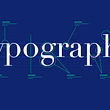
The most common question to ask yourself when choosing a font is whether you should use a serif or sans-serif font. Before we dive into when to use each, let’s first understand their visual differences.

As you can tell in the image above, the sans-serif fonts do not have the little hook as circled in serif fonts. With the word “sans” literally meaning “without,” it is easy to visually identify the difference between the two.
You can use serif and sans-serif fonts for different design scenarios and products. Serif fonts are easily readable in smaller copy, while sans-serif fonts stand out in large, bold titles. Serif fonts read as “traditional” while sans-serif fonts tend to be read as “modern.” As seen above, serif fonts have extra embellishments while sans-serif fonts tend to be geometric and unadorned.
Display and script fonts
The two other popular types of fonts to consider are display and script fonts. Display fonts are large, eye-catching fonts used for headlines or advertisements. They do not read well in body copy or text that is smaller than 14 points. Therefore, they are not used as frequently as serif and sans-serif fonts.

Script fonts are commonly used for decorative purposes. Script is great to use when pulling quotes, writing headlines, or emulating hand lettering. It is not useful for long body text.

What to keep in mind when choosing a font
Now that you understand what types of fonts you can choose from, it’s time to actually choose which ones you would like to incorporate into your design. Finding design inspiration online is a great way to start. Begin by looking at similar companies with comparable audiences, demographics, and products and see which typeface they utilize. Are financial institutions using serif or sans-serif fonts? What about newspapers, law offices, or a cupcake bakery website?
No matter which typeface you choose, here are the main things to keep in mind when choosing the best fonts for your website.
Readability and scannability
Some fonts are easier to read than others. Color contrast, character spacing, tracking, and leading are also things to consider when evaluating the readability of your font. Avoid using all uppercase text or script in larger bodies, as it forces strain on the user’s eyes. The best font size for websites tends to be 14 to 16 points.
Information hierarchy
Larger font should be on top of a web page as the H1 heading, as it is more predominant. The H2 heading will decrease in size, as will H3, H4, and so on. This hierarchy shows the reader what information they should focus on and which text is there to support it.
Simplicity
Keep your design to a maximum of two fonts, including one sans serif and one serif font. There is no need to incorporate more than one of each. If you add a third font, have it be situational. For example, in corporating a script font as your third font to emulate quotes.
Mood
Serif fonts are classic, formal, or elegant, while sans-serif fonts are modern, minimal, and friendly. It is up to your design to ensure the mood of your content matches that of the text. It’s important to note that design psychology is prevalent in typography, as it plays a role in the mood you’re trying to convey. For example, modern font psychology tells us that many contemporary, sans-serif fonts are conveyed as straightforward, trustworthy, tech-focused, sophisticated, and innovative.
7 best web design fonts
Now that you understand the important role of typography in design, let’s discuss the 7 best fonts for websites. Before we do, it is important to note that the best web design fonts are often freely available on the Internet. The best font sites tend to be Adobe fonts, Google fonts, and Microsoft fonts.
1. Open Sans
Open Sans is a highly readable, neutral, and minimalist font to choose from. This sans-serif font is one of the best fonts for user experience (UX) and readability. Open Sans is a safe option for most experiences and works best for businesses that value quality control and reliability. Some of the best websites of 2020 are designed in Open Sans.
Typeface: Sans-serif
Pairs well with: Montserrat, Lato, Brandon Grotesk, and Roboto
Download Open Sans via Adobe Fonts.

2. Montserrat
Another one of the best web fonts to choose from is Montserrat. Montserrat is a geometric sans-serif font that easily can be incorporated nearly anywhere in your site. This font scales well, as it can be easily read regardless if it’s large or small. The millennial demographic tends to gravitate toward this bold and youthful font.
Typeface: Sans-serif
Pairs well with: Open Sans, Roboto Slab, and Lora
Download Montserrat via Adobe Fonts.

3. Roboto
Roboto is a sans-serif typeface that is geometric but also has open curves. It is considered a friendly and professional font, and it is used in both scenarios. Roboto also happened to be the default font on Android and other Google services.
Typeface: Sans-serif
Pairs well with: Roboto Slab, Open Sans, Lato, Playfair Display
Download Roboto via Adobe Fonts.

4. Playfair Display
Playfair Display is a serif font with an elegant, modern quality that features undertones of femininity. This font is the perfect choice for websites with a female demographic. The lighter the weight, the more aesthetically pleasing this font is in nature.
Typeface: Serif
Pairs well with: Roboto, Lato, Open Sans, Montserrat, Georgia
Download Playfair Display via Adobe Fonts.

5. Lato
Lato is a sans-serif font that was originally created for corporate use and still works well in that space today. It feels warm and inviting while portraying high professionalism. It is a great way to give brands a modern and friendly feel, especially those who tend to be in a more serious field, such as finance and accounting.
Typeface: Sans-serif
Pairs well with: Montserrat, Roboto, Open Sans, Playfair Display
Download Lato via Adobe Fonts.

6. Merriweather
Merriweather a serif font designed to be highly readable on screens of all sizes. No matter the weight, it maintains its sophisticated feel suitable for any brand that takes itself seriously. It strikes the balance between style and simplicity often seen in luxury brands.
Category: Serif
Pairs well with: Proxima Nova, Avenir Next, Roboto, Open Sans
Download Merriweather via Adobe Fonts.

7. Helvetica
Helvetica is a sans-serif font widely used due to its versatility. There are over 100 variations available online, making it one of the most diverse fonts available. This font came to be in 1957, by a Swiss typeface designer named Max Miedinger. Generations later, it is still one of the most popular typefaces around.
Category: Sans-serif
Pairs well with: Lucida Grande, Georgia, Gibson, Roboto
Download Helvetica via Google Fonts.

Now it’s your turn
Now that you have the knowledge and understanding of typography, it is up to you to decide which typefaces and fonts are best for your design. However, before you choose a random font, think through your brand and do research on the fonts you have in mind to ensure they align with your brand identity and vision.
Additionally, if you need help sourcing fonts, many professional user interface (UI) kits online have vast collections of fonts that you can incorporate into your design system. Also, be sure to utilize online prototyping tools to create a prototype to put in front of users to gather feedback on your font choices. No matter your individual process, know the power of typography and leverage that to your brand’s advantage.

